Place Here Production
Menu
Design, Production
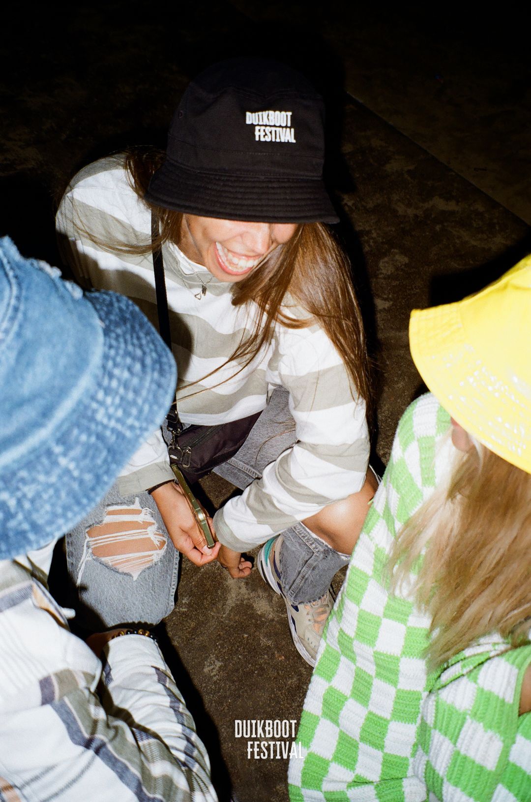
Duikboot
This next collaboration is a 100% purebred brainchild between proud denizens of Noord-Brabant. We at Place Here never shy away from an opportunity to remind people where we’re from and neither does Duikboot Festival. For this reason, it’s safe to say that it was only a matter of time for us to jump on the same boat and come together in our creative endeavors.

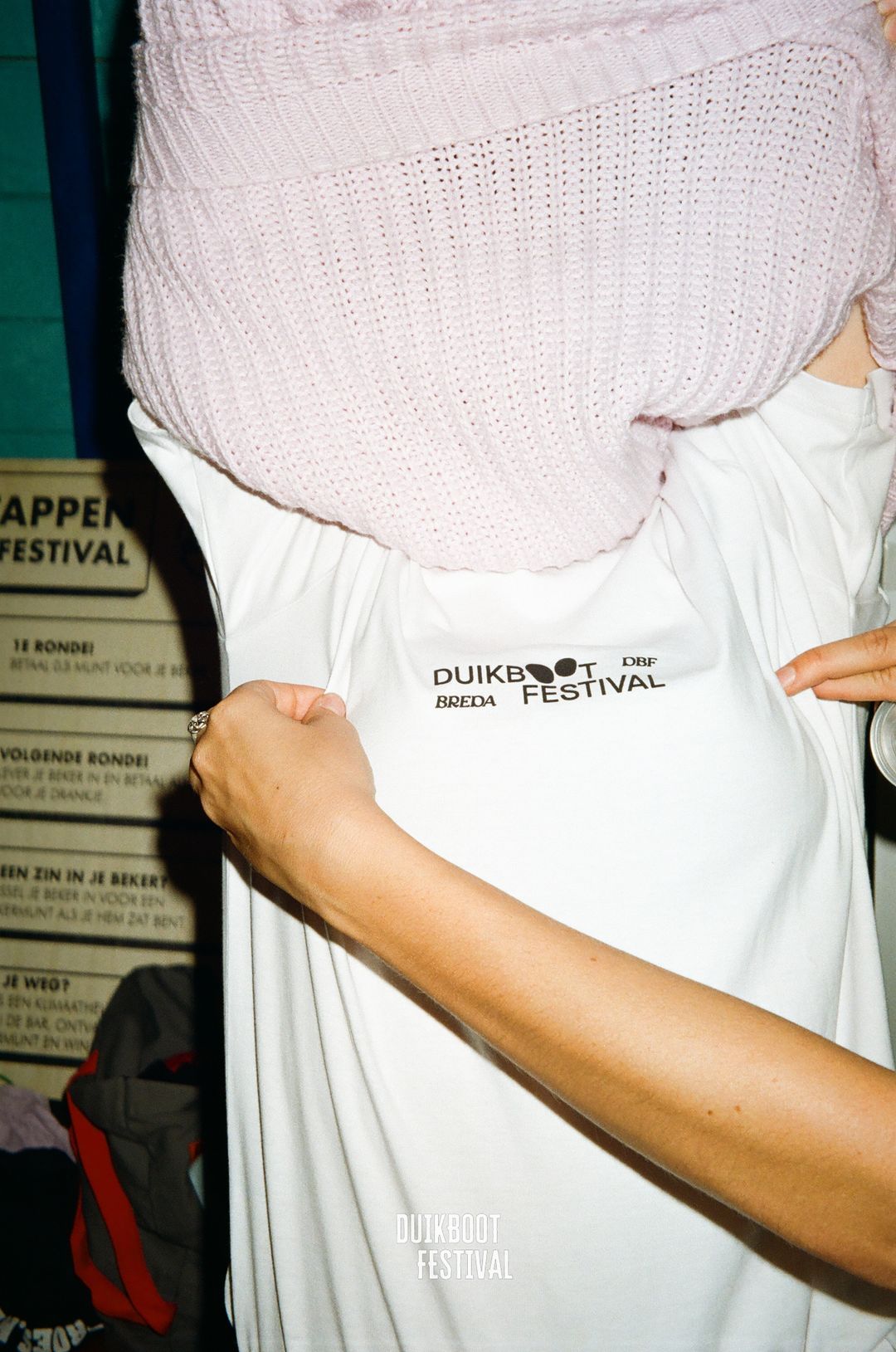
Duikboot, literally translating to diving-boat, is actually the Dutch word for submarine. This immediately drew us towards nautical themes as an obvious source of inspiration. The back of the Duikboot graphic logo tee features the word ‘Duikboot’ in an elegant, wave-like font, perfectly befitting the nautical theme we tried to invoke through-out our work. The word is diced up into single letters that are evenly scattered around the entire backside of the garment in a way that still makes it perfectly readable. The full title of the event is spelled out and centered below in a neat font that withholds everything from being to overbearing.


The Don’t be jelly tee also sports the aforementioned front print, this time in an black hue. The backpiece is where we went all-in on loud graphics, its design features a jellyfish colored in a dazzling magenta and orange gradient. Surrounded by some bubbles that we also ended up implementing in silhouette form, as a replacement for the o’s on the front of the design. We love a good punchline, so we couldn’t resist placing some witty text along the edges of the jellyfish, mixing the words ‘don’t be jelly please’ into the fore- and background to unite text and image.